


 This week I have been preparing my manuscript of poems for the publisher, which includes expression of a preference for the book’s font, and once more I have been wondering about how the poems will be viewed on the printed page. Although I am not a sophisticated typophile, I do know when authors discuss poetics among one another that a volume’s typography—its distinct style and appearance—frequently emerges as a recurring subject of conversations. Even poets who are not “visual poets,” who do not indent or experiment in any way with spatial location of their words on the page, but instead write each line flush to the left margin with conventional line breaks and punctuation, express preferences in the process and profile of characters on the page.
Many poets maintain favorites among the numerous choices of fonts. Indeed, I recall dinner debates among classmates in my graduate writing program about the merits of certain typefaces, as well as the attitude or grace contributed to the page when a slight projection of a serif adorns particular letters or an italicized word leans tastefully forward in a line. My friends and I would pull books from our shelves and compliment the arrangement of print in the poetry as presented by publishers who took pride in such seemingly minor details.
Most poets I know enjoy reading the history of the selected font as it appears at the back of some poetry volumes or the technical typography notes on the copyright page in a book’s beginning section. Interest among poets in the experience of examining an entry about the typesetting reminds me of a similar attention given to closing credits at the end of movies by my colleagues in film studies or by fellow critics when I was writing cinema reviews for newspapers and magazines.
For example, when taking a poetry collection at random from one of my office shelves, I observe the following text at the end of Philip Levine’s Breath (published by Knopf), a collection that I reviewed favorably upon its release:
The text of this book was set in a typeface called Méridien, a classic roman designed by Adrian Frutiger for the French type foundry Deberny et Peignot in 1957. Adrian Frutiger was born in Interlaken, Switzerland, in 1928 and studied type design there and at Kunstgewerbeschule in Zurich. In 1953 he moved to Paris, where he joined Deberny et Peignot as a member of the design staff. Méridien, as well as his other typeface of world renown, Univers, was created for the Lumitype photoset machine.
Admittedly, none of this matters when evaluating the quality of the poems included within a book’s covers, whether one is considering Philip Levine or any other poet. In fact, some might suggest Levine’s plainspoken poetry should be delivered by a more ordinary print. Yet, I must acknowledge a subtly elegant and appropriate typeface can help establish a positive frame of mind or increase a reader’s sense of appreciation for the content, perhaps the way certain scents whet one’s appetite when entering an Italian delicatessen or a rich aroma of coffee can create a delightful response when waking in the morning even before one has enjoyed the first sip.
Also, obviously one must recognize that the more elaborate and exotic font history does not always guarantee a pleasant response from the reader. When I read the note on the type included at the closing of Mark Strand’s Man and Camel, also published by Knopf, the historical record appears more appealing to me than the actual typeface, which I find a bit dull, though I certainly presented a mostly positive review of this collection’s content of poems at the time of its publication. The volume’s account of its type reads:
This book was set in Janson, a typeface long thought to have been made by the Dutchman Anton Janson, who was a practicing typefounder in Leipzig during the years 1668-87. However, it has been conclusively demonstrated that these types are actually the work of Nicholas Kis (1650-1702), a Hungarian, who most probably learned his trade from the master Dutch typefounder Dirk Voskens. The type is an excellent example of the influential and sturdy Dutch types that prevailed in England up to the time William Caslon (1692-1766) developed his own incomparable designs from them.
When publishers allow poets their personal preferences, font selections may merely be a matter of taste, which like options in wine, fashion, or home décor should be recognized as such. Browsing through a few other of the later collections of Strand’s poetry on my shelves (Blizzard of One, The Continuous Life, Dark Harbor), I find a consistency in that all of them are set in the same typeface and carry a similar font history at the back of each book. Therefore, although I do not find it particularly appealing, I can only conclude Strand is fond of this font.
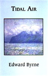
On the other hand, my unscientific sampling of some Levine collections in my home library reveals a shift in allegiance, by him or his editor, to an individual font for one reason or another. For instance, although The Mercy, which appeared just prior to Breath, contains the same Méridien font, immediately previous collections in Levine’s chronology—The Simple Truth and What Work Is—share an alternative choice described as follows:
This book was set in Monticello, a Linotype revival of the original Roman No. 1 cut by Archibald Binny and cast in 1796 by the Philadelphia type foundry Binny & Ronaldson. The face was named Monticello in honor of its use in the monumental fifty-volume Papers of Thomas Jefferson, published by Princeton University Press. Monticello is a transitional type design, embodying certain features of Bulmer and Baskerville, but it is a distinguished face in its own right.
During late-night conversations in graduate school or meetings of editors for the literary journal, my classmates and I occasionally compared personal preferences of fonts, should we ever get the option from a publisher. Today, I inspected some collections since produced by a few of my former classmates and found that, when given the opportunity, they had followed through on the selections we’d once discussed. The popular opinion back then among the group had been that a Bembo type would look best for poetry, and two of my classmates chose that font for their books, as did I when given the chance, while another used a modern version of a Garamond font, which we also favored.
The Bembo font is described briefly as “based on the roman cut by Francesco Griffo for Cardinal Bembo’s tract ‘de Aetna’ in 1495.” Garamond is attributed to a “French punchcutter, typefounder, and printer from the first half of the sixteenth century.” The Baskerville typeface, designed by an eighteenth-century Englishman, also appeals to me.
Of course, some fonts seem to me more suitable for poems with shorter lines or moderate-length lines, while others appear appropriate for longer lines. As my style of poetry has evolved toward longer line lengths over the years, the preference I hold for my poetry has moved from the Bembo type to the Garamond family of fonts; yet, I enjoy as well the Granjon font that is a later derivative of Garamond developed in the 1920s, though named after a sixteenth-century type cutter. I first appreciated Granjon when Knopf published Amy Clampitt’s The Kingfisher in that font twenty-five years ago. The note on the type in that collection informs readers:
This book was set on the Linotype in Granjon, a type named after Robert Granjon. George W. Jones based his designs for this type upon that used by Claude Garamond (c. 1480-1561) in his beautiful French books. Granjon more closely resembles Garamond’s own type than do the various modern types that bear his name. Robert Granjon began his career as type cutter in 1523 and was one of the first to practice the trade of type founder apart from that of printer.
Although, for a number of reasons expressed elsewhere, I have been a strong proponent of online publishing of literary journals, especially for poetry as evidenced by Valparaiso Poetry Review now entering its tenth year, I maintain an affection for poetry books and an avid devotion for fine printing—the feel of a volume in the hands, the physical turning of pages, and the distinct appearance of a classic font on a paper background. All forms of fonts can be imitated electronically; however, the distinguished and distinguishable character of a type often gets lost when illuminated on a computer screen.
Even now, as the Kindle e-book becomes more popular and many additional texts are available online, I know I am not alone among those who write poetry (or fiction, for that matter) when I continue to admire print positioned on a paper page—its proportional spacing, the thick or thin strokes, the tapered edges and sharp or hairline serifs, and the characteristic ascenders or descenders of minuscules. For me, these characteristics define not just a typeface in which a poem is published, but also describe features that for decades in a multitude of books have helped fix in my mind the face of poetry.


6 comments:
Very glad to see your thoughtful post on type choices
and type awareness, something greatly lacking in many magazines that seem to be satisfied with any old font. The type choice, page design,and attention to small details of leading and kearning are my first clue to a caring publication. I give copies of Robert Bringhurst's Elements of Typographic Style because it
gives type and page design its due.
That note at the end of the book has a name. It's called a colophon, originally the printer's trademark but now often applied to the typographer's note. (I understand that poets care about words, so I thought you might like to know that one.)
Authors--and readers--fall into two groups in my experience.
A large group of them are completely focused on content and insensitive to form. All they see is the continuous stream of symbols--the abstract letters themselves--with no cognizance of their glyph shapes or their arrangement on the page. "Italics? What italics?"
The second group are reachable at an aesthetic level, and it's obviously more gratifying for a typographer to work with them. I would always rather throw design essays at a client who can look at them and react with a feeling or an opinion than get back an I-don't-care response.
Poets in particular tend to have strong opinions on typography, as your post suggests.
The danger, though, is that the strongly opinionated author may discount or dismiss the advice of the experienced typographer, someone who brings a depth of understanding to the page and, if respected as a valued colleague, can significantly enhance the final presentation of your work.
Thanks for the information, Dick. I was aware of the "colophon" term; however, I was unsure if it truly applied just to notes about the font, particularly since those notes sometimes appear briefly on the copyright page rather than at the back of the book. I now understand the colophon does not necessarily have to be the final element in a book and may appear on the copyright page.
I also had been under the impression that a traditional colophon usually included additional details, such as the publisher's imprint and information about the authorship. However, as you mention, in contemporary publications the "colophon" may simply be "a note about the type."
Thanks, again.
--Ed
You might enjoy this ten-page article about the history of type:
http://jacketmagazine.com/02/gardtype.html
John,
Thanks very much for the link. I found the article entertaining and enlightening. I recommend it to everyone interested in this subject.
--Ed
So nice to find blog posts like this after so many years. Like oases in the desert the internet has become.
Post a Comment